Redesign by Method, Not by Tweak: The Command I Wrote and Then Ignored
I wasted an afternoon redesigning a page one CSS tweak at a time and made it worse. Here is the method that fixed it, and why I turned it into a command.

A few weeks ago I set out to redesign a single page: the detail page of a public-records lookup tool I run, the kind of page where someone pastes an ID and gets back a structured record. I know how to do this. I have done it many times. So I opened the CSS and started improving things.
Four hours later I had a page that was worse.
Not broken. It rendered, the tests passed, the data was correct. It was just bland. The spacing was almost right and therefore wrong. The header did not line up with the content beneath it. There were two different ways to start a new search sitting a few inches apart. And when I finally opened a real record instead of my tidy sample data, two fields were quietly broken in ways my mock had hidden. I had spent an afternoon and produced a page I would not ship.
The frustrating part is that I already owned the fix. I had written it down months earlier, as a checklist, and then, in the moment, with the CSS open and a dozen small improvements calling to me, I skipped it.
The tweak-by-tweak trap
Here is the failure mode, because I suspect it is not only mine.
You open a page that needs work. You see a hundred small things, so you fix them one at a time. Recolor a status dot. Nudge a pill. Bump a font size. Round a corner. Each change is a tiny, satisfying win, and each one is real. The page is measurably better after every commit.
And yet the finished result is bland and slightly off, and you cannot say why.
The reason is that tweaking optimizes at the wrong level. A composed page, one that reads as designed rather than assembled, is not the sum of a hundred good local decisions. It comes from a small number of global ones: a single page container, consistent left and right gutters that everything hangs off, a real type scale, and one job per element. Tweak-by-tweak never touches those. You can recolor dots all day and the header will still be misaligned with the body, because alignment is a page-level property and you were working at the element level.
When I finally stepped back and looked at the whole page instead of the element I was fiddling with, the real problems were obvious, and none of them were colors:
- The page header and the content below it hung off different left edges. Nothing lined up.
- There were two controls to start a new search, a box and a separate text link, a few inches apart. One job, done twice.
- Raw values from the source system rendered in shouting all-caps (
ISSUE BW/NBW) because I was displaying them exactly as stored. - The layout was a single tall column of full-width cards with oceans of empty space on wide screens. Sparse, not calm.
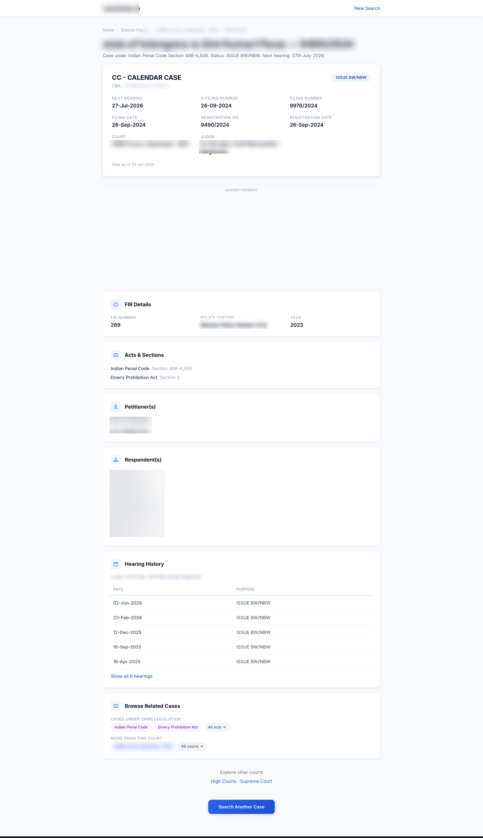
And two bugs I only found on real data:
- The top of the record showed a blank where a date should be, because the real record had a field my sample did not.
- A label repeated identically on every row of a timeline, which looked fine with one hand-made sample and absurd against a real history.
Both had sailed past my “it looks done” check, because I had verified against a mock instead of against production.
The method I had already written down
Months earlier, after a different redesign went the same way, I had done the sensible thing and written the process down. Not in a doc I would never reread, but as a slash command I could actually run: /redesign-page. In my setup a slash command is just a saved prompt with a name, and giving the method a name is the whole point. A named thing gets invoked; a doc gets forgotten. Future-me does not need to remember the discipline, he needs to type /redesign-page and be walked through it.
The command is eight steps, and my ad-hoc afternoon had violated the first six. Here is the method as principles, rather than as my particular prompt, so you can steal it.
The method
1. Reach for the design discipline before the CSS. The first move is not to open the stylesheet. It is to load whatever design discipline you have (a skill, a checklist, your design-system doc) and read it. Opening the CSS first is precisely how you end up tweaking. The rule I broke was the simplest one: invoke the method before touching pixels.
2. Get a concrete reference. Precision comes from having something specific to match. Before designing, name a reference page, a competitor’s equivalent or one of your own pages whose composure you like, and match its grid: where the gutters sit, how the type steps, how much air each element gets. “Make it look nicer” gives you tweaks. “Make it line up like that page” gives you a layout. A reference converts taste into measurable decisions.
3. Precision beats color. This is the load-bearing idea. What makes a page look composed is almost never more or less color. It is alignment, consistent gutters, a real type scale, and one job per element. When a page looks amateur, the fix is almost always geometric, not chromatic. I keep relearning this, because color is the fun, visible knob and alignment is the boring, invisible one, and the boring one is the one that matters.
4. Mock first, and iterate on the mock. Build a static mock with real sample data (never lorem), put it on screen, and critique it against your reference before you write a line of production code. Then show it to a human and cheaply throw away the versions that do not work. The tweak-by-tweak trap is really a symptom of skipping this step: with no approved mock, every production edit becomes a live experiment, and live experiments are where afternoons go to die.
5. Familiar beats distinctive, when you have an identity to respect. A general design skill will push you to be bold and take an aesthetic risk. That advice is right for a consumer brand and wrong for an institutional utility, where a surprising page costs trust. Apply the craft of the design skill (precision, self-critique, type discipline) but not its “be distinctive” default when the product already has an established, familiar identity. (I wrote about that specific tension, looking boring on purpose, separately; link at the end.)
6. Normalize display values once, at the data layer. That shouting ISSUE BW/NBW should become Issue BW/NBW in one normalizer that every render site shares, not via a toTitleCase scattered across templates. And prefer a normalizer that passes unknown values through untouched over a rigid list that breaks the day the source system emits something new. Fix the class of bug, not the instance.
7. Review the whole surface on every pass. The single most valuable habit. After each change, look at the entire page (header against content, gutters, redundant controls, capitalization), not just the component you touched. Tunnel vision on one timeline or one card while the page-level alignment stays broken is the exact mistake that produces a bland result. Zoom out every time.
8. Verify on real data, then stop before you deploy. Run the near-final design against real production records, not your mock, at both a desktop and a narrow mobile width. Real data is where the blank dates and the repeated labels surface. Then stop, put the whole reworked page in front of a human, and deploy only on an explicit yes.
Same data, a composed page
I threw away the afternoon of tweaks and ran the method from the top. The result is below. It is the same data, the same routes, the same content. What changed was the process, and therefore the geometry: one container with consistent gutters, a single real search box in the header, a two-column layout that uses the width instead of wasting it, a proper timeline, and values normalized to sentence case. The header lines up with the body. There is one way to start a new search.
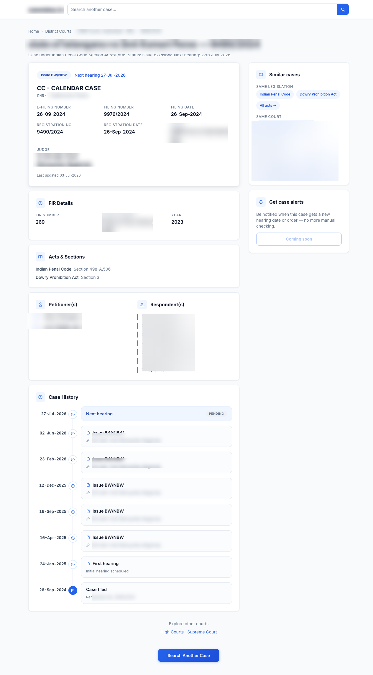
None of that came from a clever trick. It came from making the global decisions first and the tweaks last, which is the exact opposite of what I do when I “just start improving things.”
The actual lesson
The thing I want to remember is not any single step. It is that I already had the method, and the afternoon was wasted because I did not run it. Knowing a discipline and invoking a discipline are different acts, and under the small, satisfying pull of a hundred easy tweaks, knowing loses.
So the fix was not to learn anything new. It was to make the method cheaper to invoke than to skip: a named command, /redesign-page, that I run before I open the CSS. If you have a hard-won process you keep abandoning in the moment, that is the move. Give it a name and a trigger so future-you trips over it instead of having to summon it, the next time you redesign a page, or do anything else you already know how to do well.
If you want the companion piece, the design doctrine this method produces and why I deliberately made a utility look boring, I wrote that up here: The One-Second Trust Test.