The One-Second Trust Test: Why I Made a Utility Look Boring on Purpose
I redesigned a public-records lookup tool to look less distinctive and more institutional. Here is the doctrine, the step-by-step playbook, and a live before/after demo you can click through.

A while ago I looked at the homepage of a public-records lookup tool I run - the kind of site where someone pastes a case number and gets back the status of their court case - and realized it had a problem I had been quietly proud of.
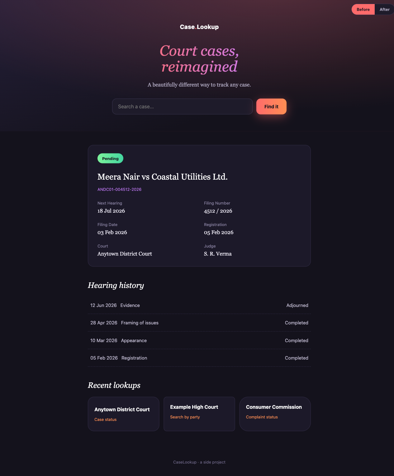
It looked distinctive. Dark hero, a gradient headline set in italics, a warm coral call-to-action, a confident “reimagined” tagline. It looked like a product. And that was exactly what was wrong with it.
The people who use a tool like this are often first-time litigants. Frequently older, frequently on a cheap phone, usually anxious about a real legal matter. When they land on the page they run a single fast mostly-unconscious check: is this a real, legitimate, official service, or is this someone’s side project that will waste my time or try to charge me? My beautiful dark hero was failing that check. It looked like a startup, and to that audience a startup is not where you go to check the status of your court case.
So I rebuilt it to look boring. Institutional. Familiar. Here is the “before”:
This post is the doctrine I used and the step-by-step playbook, anonymized so it transfers to any utility. There is a live before/after demo at the end you can click through yourself.
Trust by familiarity
The core idea fits in one sentence: for a utility or institutional product, trust comes from familiarity, not from beauty.
Users decide whether to trust a page in about a second, and they do it by pattern-matching against every other site in the same category they have ever used. A bank portal. A government records site. An airline check-in page. If your page matches that mental template, the user relaxes and reads on. If your page surprises them, even in a way a designer would call tasteful, they pause. That pause is the cost. On a utility, a moment of “wait, what is this?” is a moment of doubt, and doubt on a legal or financial tool is expensive.
So the rule I now design by is uncomfortable for anyone who likes making pretty things: familiar beats beautiful, and boring-institutional beats distinctive-clever. A page that looks like the kind of official service the user already expects will out-convert a more original one almost every time.
This does not mean ugly. It means you steal the right things. You can absolutely borrow principles from the beautiful editorial and AI-brand design systems everyone admires: restraint, generous whitespace, a single confident accent, a clear type hierarchy. What you must not borrow are their tokens. A cream background, a serif body face, a coral accent - those read “boutique AI product,” and on a court-records lookup they actively reduce trust. You would be wearing someone else’s identity, and it is the wrong one. My original dark-and-coral hero was a textbook case: I had lifted the surface of a design language built for a completely different category.
Ruthless consistency and polish
The second half of trust is not a big idea, it is a thousand small ones done the same way every time.
- One spacing scale. Every margin, padding, and gap comes from a single set of values. No one-off numbers. If two gaps look similar, make them identical.
- One of everything. One button system. One type scale. One accent color. The moment a page has two blues or three card styles, it stops reading as a single coherent institution and starts reading as a thing several people bolted together.
- Aligned, equal-height cards. A grid where the cards do not line up looks amateur in a way users feel before they can name it.
- No jank, ever. Reserve height for anything that loads late (ads, images, async results) so nothing shifts under the user’s thumb. Field Cumulative Layout Shift is not just an SEO number, it is a trust signal. A page that jumps around feels unfinished, and unfinished feels untrustworthy.
Inconsistency reads as “not a real institution.” Consistency is most of what “looks professional” actually means.
The playbook
Here is the concrete sequence I follow. It is deliberately additive, so you can ship it on a live site without a scary big-bang rewrite.
1. Design tokens first
Before changing a single pixel, collapse every scattered color literal into one named scale. This is pure indirection and changes nothing visually, which is exactly why it is safe to do first. It is the move that later lets you have one blue instead of nine slightly different ones.
:root {
  /* One institutional blue - actions, links, active states */
  --blue-600: #2563eb;
  --blue-700: #1d4ed8; /* hover */
  --blue-100: #dbeafe; /* hero wash */

  /* Neutrals and text */
  --text: #0f172a;
  --text-2: #475569;
  --muted: #94a3b8;
  --border: #e2e8f0;
  --surface: #ffffff;
  --surface-page: #f8fafc;

  /* Spacing scale - the ONLY allowed spacings */
  --s4: 4px;
  --s8: 8px;
  --s12: 12px;
  --s16: 16px;
  --s24: 24px;
  --s32: 32px;
  --s40: 40px;
  --s64: 64px;
}
Now every component references var(--blue-600) and var(--s16) instead of a raw value. Swap the anchor here and the whole site re-skins with zero markup changes.
2. Anchor on one institutional color
Pick a single anchor and commit. I chose a refined institutional blue: bright blue on white, unified across every page, with a rare gold used only as a seasoning on the odd highlighted word. The old heavy dark hero was retired entirely. Blue goes on the things the user acts on (search, links, primary buttons) and on one calm header wash. White space and neutral text carry everything else. One blue, one gold, no exceptions - the moment you invent a second accent “just here,” consistency is gone.
3. Build a canonical component set
Design each of these once and reuse it everywhere: one button system (primary, secondary, disabled), a light institutional page header instead of a dark hero, a trust-stat strip of confident true numbers (“2 crore+ cases indexed”, “updated daily”, “free, always”), two-tier cards, calm status pills, a quiet breadcrumb, and a data table with uppercase muted headers. The trust-stat strip in particular was the single biggest missing lever: a scannable band of real scale stats does more for credibility than any amount of color work.
4. Roll it out additively, not big-bang
This is the part that keeps you sane. Do not migrate the whole site at once. Instead:
- Build the token system and the components on a throwaway,
noindexstyle-guide page first. Prove the whole language in one place where nothing can break. - Then migrate the highest-trust, lowest-risk page (usually the homepage).
- Then move page by page, each as its own small, verifiable change.
Every step is independently shippable and independently revertible. You never have a moment where the site is half-migrated and fully broken.
5. Carry your tokens into the critical CSS
Here is the trap that will bite you. To kill the flash of unstyled content, you inline the above-the-fold CSS in the <head>. But if your :root token block is in the external stylesheet and your inlined critical CSS uses var(--blue-600), then on a cold cache the first paint has no idea what --blue-600 is. You get a flash of unstyled or wrongly-colored content precisely on the first impression you were trying to protect.
<head>
  <style>
    /* Critical CSS MUST include the tokens it references */
    :root {
      --blue-600: #2563eb;
      --text: #0f172a;
      --surface: #fff;
    }
    .header {
      background: var(--blue-100);
      color: var(--text);
    }
  </style>
  <link rel="stylesheet" href="/site.css?v=42" />
</head>
Put the :root block (or at least the tokens the above-the-fold markup uses) inside the critical CSS. Then verify on a throttled cold load that there is no flash and that layout shift is zero.
6. Cache-bust when you ship shared CSS
If your CSS is cached for a year at the edge, then any changed byte needs a bumped version string (site.css?v=42) or a fraction of your users see a broken half-old, half-new page. A forgotten bump is a silent, long-lived bug. Make it part of the same commit as the CSS change, every time.
The result
Same content, same data, same routes. Only the look changed. Here is the “after”:
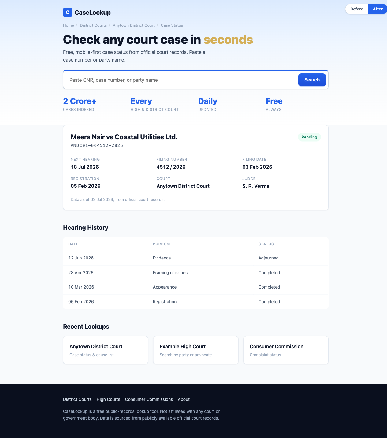
I built both of these as standalone pages so you can compare them directly. Open them and use the corner toggle to flip between the two:
Open the “after” page’s source too. It is a small worked example of the playbook: the whole design system is one :root block, there is exactly one blue, and every component is built from the same tokens.
Test, do not argue the aesthetic
One more discipline, because taste debates are a trap. When there is a genuine fork and reasonable people disagree, do not argue it in a meeting. Mock two or three directions and run a quick five-person preference test. Decide from evidence. It is faster than the argument and it is right more often, and it takes the ego out of a decision that should belong to the user.
When this applies
This whole doctrine is for utility and institutional products: anything where the user’s first question is “can I trust this?” rather than “is this delightful?” Legal tools, financial dashboards, government-adjacent services, health lookups. If you are building a consumer brand where surprise and personality are the product, throw most of this out. But if you are building the boring, load-bearing tool that someone anxious needs to work, the most respectful thing you can do is look like exactly what they expected. Boring, on purpose, is a feature.